Monday, August 30, 2010

Experimenting with Effects

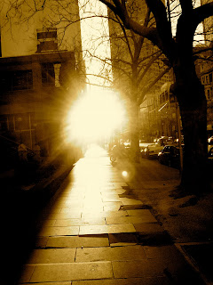
Collins Street 7am

Sepia: I took these on my way to work one Morning...


I've been learning more about how a photo can look and have a completely different atmosphere and feel about it especially when I changed these photos to Sepia I felt that you could appreciate the buildings and brick walking path more so than when it was in its original colour.

Sunday, August 29, 2010

Week 5: Montage Selfportraits

These Photos were taken around Aireys Inlet over the weekend when I went to visit my step mum. Just thought I would put them up on the blog because they helped me to learn how to use the layer mask tool and set frames better in photoshop..


It was especially hard to get the shots around the lighthouse as their was a lot of people walking around and going up for tours but it was all just about being patient and waiting for the right moment.
The three middle shots are of my step mum Susan doing some yoga poses...


The first portrait that I decided to do was on some stairs at uni next to the bookshop. I didn't have a tripod but their was a shelf that I put the camera on instead which worked almost as well.
It was a bit harder trying to do it by myself too because I couldn't really tell if I was in the frame or out but it still worked relatively well.

Thursday, August 26, 2010

Week 4: Organising Photos


I prefered this photo in colour...


The Black seemed to take away from the life
of the picture rather than highlight it...

We watched the second episode of the Genius of Photography this week and I learned a lot more about the ideas and themes that some photographers stuck with in their works.

I also really started to appreciate the way some photos looked better in black and white rather than colour as it can make them look more natural and highlights certain parts that can be drowned out and distracting when in colour like the photos below...


The Adobe Bridge Application was also really helpful with better organising my photos and eliminating the bad photos from the good. Their was useful options for viewing and organising too such as star ratings out of five.

I found it really helped me figure out where I was heading with my final folio as I wasn't sure if I wanted to do more abstract Light photos or repeated photos of the same place at various times but after going through all the photos I've already taken I think I'm definitely leaning towards the abstract.
Sunday, August 22, 2010

Week 3: Colour Exercise

Red 1

Red 2

Orange...

Yellow 1

Yellow 2

Blue

Green 1

Green 2

Purple: I had trouble finding something purple so I took a photo of my scarf but it turned out a bit blurry...

Brown

Converted to black and White and colour boosted

Original Black Photo

Friday, August 20, 2010

Week 3: Circles


These are the 20 pictures of different circles taken in Footscray...

I wasn't happy with how a lot of them turned out in comparison to the other colour exercise. But their was a couple that turned out a bit better than I originally thought...
I did find it hard trying to get the circle in the same frame on the right side of the photo as some things had to be zoomed in more than others, while on the other hand I had to step back at more of a distance if the circle was too big.

Wednesday, August 18, 2010

Week 3: Photo Stroll Exercises


I couldn't decide which exercise out of the three different ones I wanted to concentrate on so I tried to have a go at all of them and then decide which ones I was having the most success with which was Exercise 2 Vanishing Point/ Perspectives and some of he circles but the eight colours was probably my favorite in the end.